Windows binary package is HERE.
You can also use the SOURCE to build your own copy (requires Raylib 4.0+).
I got motivated over break, and that happened. And in ~6 hours, which is fast as hell for me. But there was a little cheating involved, as I'll detail below. The short story is that I always try to do something creative at the end of the year. Obviously my success rate is questionable at best, but we won't go into that
Anyone who knows me well, knows I grew up with and still adore intros and cracktros. The combination of simplicity and raw creativity makes for an interesting format. Despite the self-imposed limitations of the institution, there's considerable flexibility in terms of art, music, and effects. The old stuff was usually some copper bars and sine wave effects, and really you can accomplish quite a lot with a few good sine waves (as we'll see below).
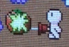
Once the decision was made to work on an intro (and in this case, it being the end of the year, I've chosen to call it an Outro instead. Lovely, yes yes), I started by coming up with a few ideas and rounding up some assets. I'd need a general idea of what I was aiming for, and some background art, a suitable group of bitmap glyphs, and a little mood music. I could cobble that together. I decided on a winter theme, so we'd be using blue-white hues, and snowflake particles. I also decided up-front I'd crib from previous intros and use the big "GDR" as the demo's center-piece. It'd get the bulk of the attention, and effects. The scrolly would use the same font, for expedience, and would receive whatever effects I felt like giving it (which turned out to be... almost nothing).
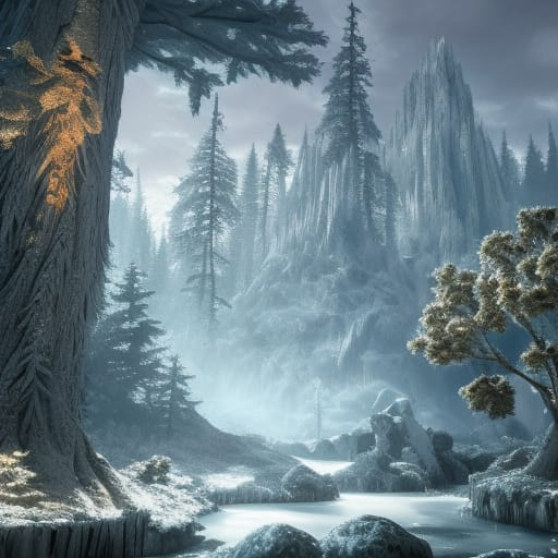
I pulled together the background art from an online AI generator (dunno which one, I was in a hurry). My first prompt with "fantasy winter" got me the above result, which was pretty damn close to what I was hoping for. The only problem is that it's a terribly noisy picture; I'm not 100% certain if that's due to the nature of the generation process, or some sort of compression on the output (or both, hell). Either way, it looks good as a tiny pic, but when you zoom in things get a little fugly. Fortunately, I happened to have my CRT shader handy, and it did a fantastic job of obscuring the jank in the background. This saved me several hours (or more) trying to clean up the background.
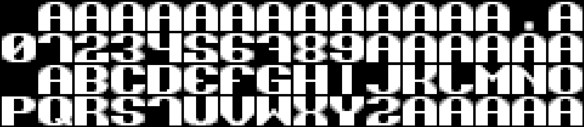
I started pulling some glyphs together by visiting an archive of old cracktro/intro/scene fonts, and found one that unfortunately had no attribution. I snipped and arranged the glyphs into a format the program would understand, created a matching alpha channel, and also added several glyphs that were missing from the set. I probably spent about an hour just on getting this asset going, because it's kinda important. I debated using a larger 32x32 font, before settling on the 15x13 one (weird dims, but whatever). I didn't bother converting it to a proper format that Raylib would understand. That would take extra time, and I didn't plan on using any of Raylib's font functions.
I had a perfectly useful 32x32 snowflake texture that I'd just used in the last 4x4x4 compo, so that was handled in short order. I had originally planned on having the text randomly sparkle, and went so far as to pull in another 32x32 texture for that purpose (again, from the same 4x4x4 entry), but I never got around to using it. Indeed, I don't feel like its omission was to the final work's deficit.
The bulk of the main effect would be in a wide window centered atop the screen. The background was too tall to get on the whole screen, so I set up a gentle sine wave to pan vertically across most of the background image. I was worried it would prove to be a distraction, but to my surprise the effect is mild, and blends into the whole ambiance of the demo. The three "GDR" letters would be drawn, and I wrote a routine that would look at each pixel of a glyph and draw it as a series of squares, with varying positions, scales, and white space, based off several sine waves. This took a good bit of time to get "just so", and was not the effect I had initially aimed for. I was intending to have the letters bob, and flip over as a sine wave crossed the screen horizontally. However, once I saw the code execute, the effect was altogether different, but I liked it so much I carried on with what I had, and tweaked that to my satisfaction.
The background was fairly simple, and took about an hour to get the way I wanted it. I draw a pair of gradient lines just above/below the letters, and set up a scissor section between them. I hammered together a couple of routines to spawn and update/animate the snowflakes, which would drift from the top of the screen, randomly angling themselves and their rotation, and would shrink as they traveled. Snowflake colors would vary from a strong blue to near-white, using Raylib's HSL routine (I also had my own, but why bother?) I set up a base color and varied the saturation by the scale of the snowflake. I had also intended to vary the speed by the size of the flake, but in the end felt this was unnecessary, and moved on.
The scrolly used a slightly simpler version of the routine that drew the large "GDR" letters. Initially I wanted to let the routine handle both duties (and you can see this in some of the arguments), but I split it into two once things started to get cluttered. No big loss there. The alpha channel of each glyph is checked, and blank pixels are rejected, as one would expect. Pixel blocks that are drawn close to the edges fade out smoothly. I played with the scroll speed for a while. Then I wrote a bunch of text, let it run for a few cycles to ensure proper repeating, and moved on.
I visited the Internet Archive, and found a bunch of old chiptunes. I picked one out that was both ancient, and not something I recognized (and I've heard a lot of them. A lot a lot). The problem with really old stuff is a matter of attribution, but at least this time I had a group name. They've been credited in the readme. I set the track up to repeat. The thought occurred to be that I might want the music to fade in, but this didn't end up being necessary.
And there you have it. One "outro" in ~6 hours of work. Again, if I'd had to hand-draw my own background, totally draw my own glyphs, and compose my own music that would have probably added a week to the production (mostly for music; I could bang out a font in about an hour or two).
Final thoughts: Maybe next time I could drop out the demo with a little "tv static", since I used a CRT shader.